
Building a faster, smarter UI kit
When I joined the team, our core design infrastructure still lived in Sketch whilst some designers were working in code. It had served us well for years but as the company scaled and our design system started, it was becoming clear that the tooling was holding us back. Collaboration was fragmented. Hand-off was manual. The UI kit was becoming increasingly brittle to maintain and extend.
So we made the call to move to Figma. This wasn’t just a tool swap but an opportunity to rebuild our UI kit from the ground up with scalability, consistency, and design/dev alignment in mind.
Objective
We wanted to create a centralised, reliable, and scalable UI kit in Figma that would unlock better collaboration, reduce inconsistency, and enable faster iteration across product teams.
This wasn’t about replicating our Sketch files but rethinking the system in a way that could better support growth, contribution, and velocity.
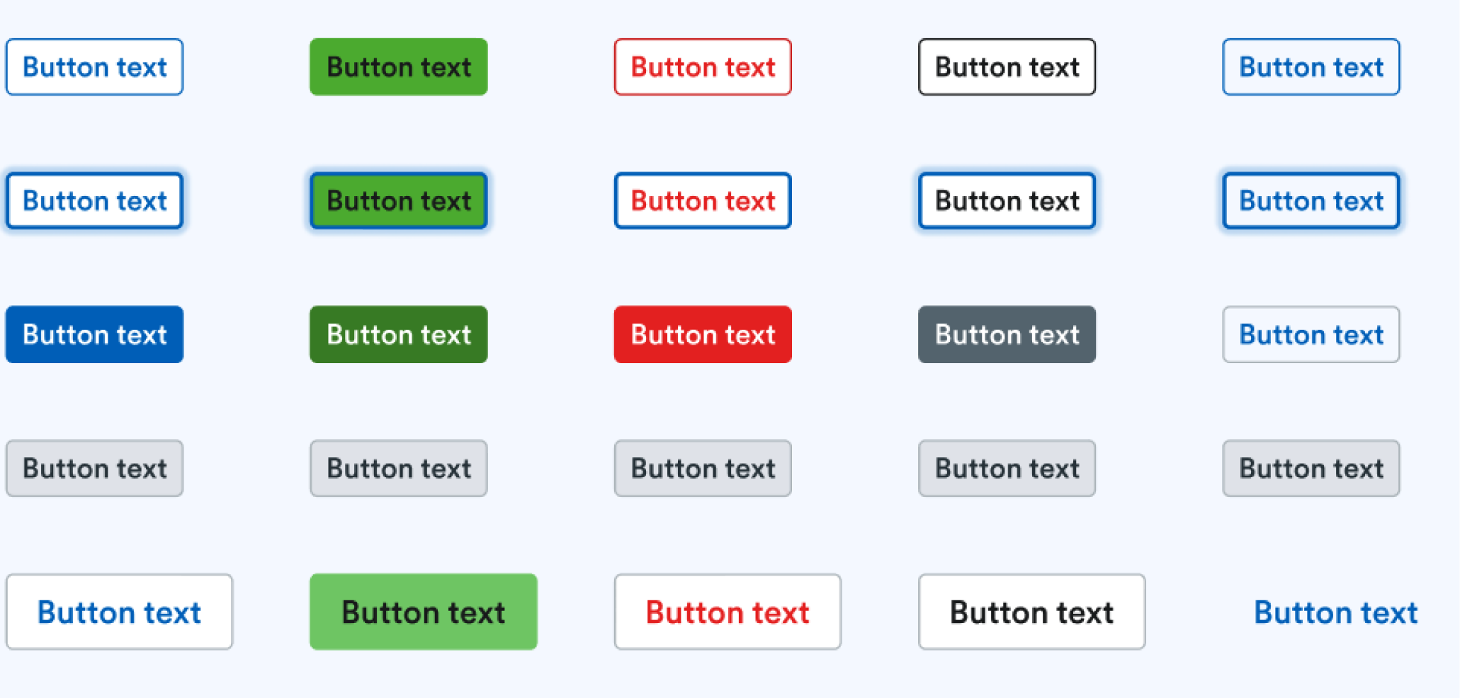
Screenshot of all Button variants in Figma.
Challenges & Goals
The existing Sketch kit was outdated, fragmented, and hard to maintain.
Teams were duplicating work or reinventing components due to confusion or misalignment.
Designers and engineers lacked a single source of truth, especially when it came to variants, states, and design language.
Some designers were creating design fragmentation in the code.
We needed to migrate while minimising development disruption and seize the opportunity to improve the UI kit, not just port.
Solutions
We built a Figma UI kit rooted in our design system foundations with clear architecture, reusable components, and contribution guidelines. We used this migration to:
Refactor and simplify components, using variants and properties to reduce bloat
Apply Figma styles to ensure design language consistency
Establish clear naming and structure conventions across foundations and components
Create Figma templates and usage guidelines to help teams adopt and contribute faster
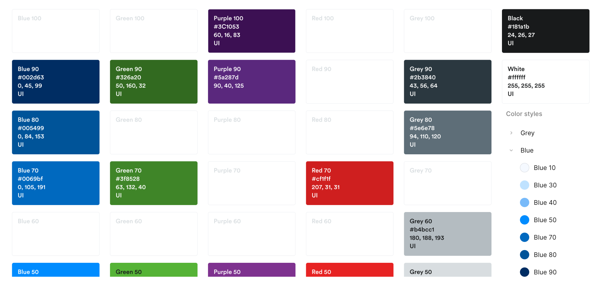
Colour palette and styles in Figma library.
Process
I led this migration as a Design Systems Lead, working closely with other designers and engineers to ensure the new UI kit reflected both real-world usage and future needs.
Audit & mapping
We started by auditing the Sketch files and identifying what was still valid, what needed to be redesigned, and what was missing entirely. We mapped key components, foundations, and token usage to ensure a clean migration path.Design system foundations first
We established our foundations. Spacing, type, colour, etc, using Figma styles. This gave us a future-ready base for tokens.Component refactoring
We didn’t just rebuild, but we optimised. Components were redesigned to be more modular and flexible, leveraging Figma’s latest features (variants, nested instances, properties). We reduced duplication, improved accessibility support, and aligned more closely with code.Collaboration and testing
Throughout the build, we shared weekly progress with our design and engineering partners, gathering input and validating decisions. We tested real workflows like creating a form or a modal to ensure the kit worked in practice, not just in theory.Enablement and launch
We documented component usage, setup instructions, and contribution guidelines within our Figma and ran live demos to onboard designers. We also ran training sessions and created a space on Slack for specific UI kit questions.
Results and impact
🚀 Faster design velocity: Teams now work from a single source of design truth reducing rebuilds and inconsistencies
🤝 Improved design & dev alignment: Better naming and structure making hand-off clearer and reduce implementation gaps
🔁 Simplified updates and maintenance: Our modular structure allows faster iteration and more confident updates to components
📈 Increased system adoption: Designers across the company moved to the new kit within the first month, citing it as more intuitive and flexible
By rebuilding our UI kit in Figma with purpose and structure, we created a faster, smarter foundation that scaled with our teams and the product.
Overall outcome
Quicker design iteration, more consistent experiences, and a stronger foundation for product development