
Modernising and speeding up date selection
Date pickers seem simple, but they’re not. Ours had long been a point of friction for our users. Outdated styling, clunky behavior, and limited flexibility. It wasn’t a top support ticket, but it was quietly causing frustration and slowing users down.
When we began evaluating the most valuable experience improvements, we realised there was an opportunity to improve not just the visual design, but the user experience of selecting a date. We had 166 date pickers across our product that our users engaged with, so this was a pretty impactful user and product experience update.
Objective
To replace an outdated third-party date picker with a custom component that’s:
Visually aligned with our brand
Faster and more intuitive to use
Flexible for a range of user types and workflows
Fully accessible and easy to implement in code
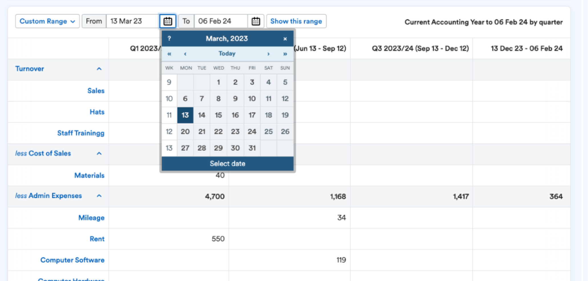
The old outdated third party datepicker
Challenges & Goals
The old component looked and felt disconnected from the rest of our UI.
There was no way to quickly jump between months or years, which created friction for users selecting dates far in the past or future.
The input field was rigid about date formats, with little error tolerance or guidance.
Accessibility was poor, particularly for keyboard and screen reader users.
Despite these issues, it wasn’t showing up in support tickets, so we had to validate the problems ourselves.
We also needed to serve different user behaviours. Basic users selecting a single date from the picker and power users (like accountants) entering exact dates by hand.
Solution
We designed and built a new, on-brand, fully accessible, and flexible date picker component with both visual and input improvements. Key changes included:
A modern, clean design aligned with our design language
Button selectors for month and year navigation to reduce friction
A more forgiving text input that allows users to type pre-selected date formats
Full keyboard navigation and screen reader support
Tech updates to improve implementation and long-term maintainability
Documentation and usage guidelines on our FreeStyle reference site
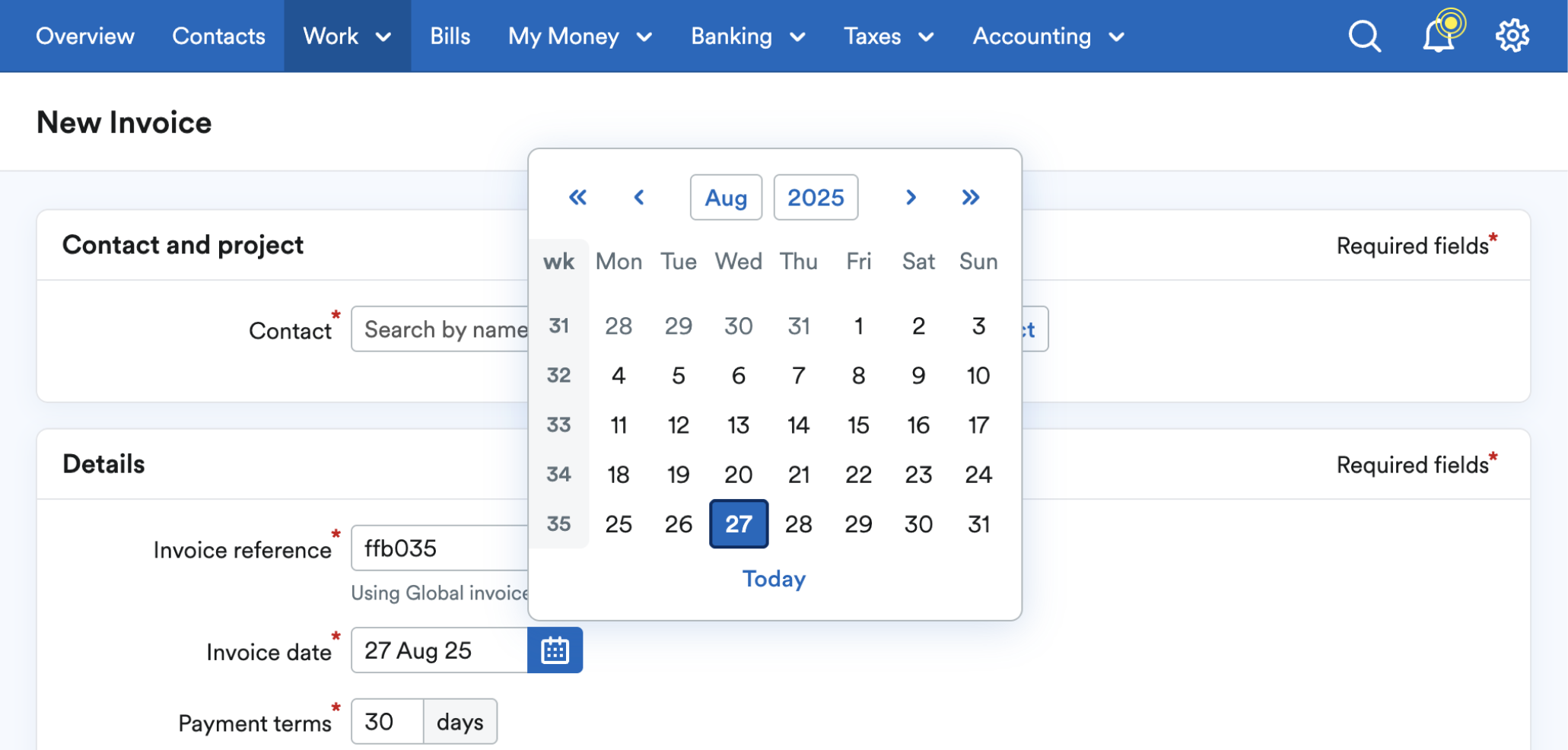
New more modern date selection
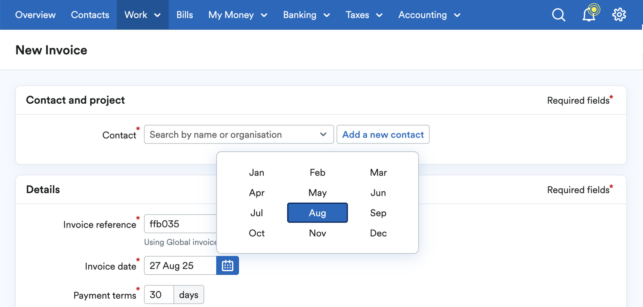
Quicker month and year selection
Process
1. Benchmarking and research
We started by auditing our existing date picker and comparing it to components used by other trusted design systems. We noted pain points around format handling, navigation friction, and accessibility gaps.
2. Cross-functional design
I worked closely with design system engineers and designers to ideate improvements. From the start, this was a systems problem and not just a UI one. We wanted the component to be flexible across contexts (single date, ranges, optional fields) and friendly for both novice and power users.
3. User testing & beta release
Since issues weren’t coming through support channels, we validated pain points through a structured testing plan. We worked with our research team to test interactive prototypes with real users and released a beta version and gathered feedback from a subset of users.
Feedback confirmed what we suspected:
Users found the new date picker cleaner, faster, and easier to navigate
Accountants and power users especially appreciated improvements to the text input
Users selecting past or future dates found it much easier to navigate
Keyboard users had a significantly better experience with focus states and shortcuts
4. Documentation & rollout
We released the new component in our UI kit for designers and published comprehensive usage and technical guidelines in our FreeStyle reference site, including accessibility and formatting tips.
Results & Impact
✨ Modernised experience: The new date picker is visually consistent (166 instances), accessible, and intuitive. Improving both first impressions and everyday workflows.
🕒 Faster interaction: Month/year buttons cut down time on long-range selections.
🎯 More accurate input: Improved text entry support helped eliminate formatting friction.
♿ Accessibility built in: Keyboard users now have full access and control.
📈 Positive feedback: Users called it “cleaner,” “faster,” and “more professional.”
💻 Product-wide adoption: The date picker has been updated throughout the product.
🧱 Systemised for scale: The component is now easier to maintain, extend, and implement with clear design/code parity and guidelines.
Overall outcome
Customer experience consistency and experience quality at scale.