
A unified design language that boosts consistency
When our company launched its new brand identity with updated typography, colour, spacing, and visual language the design system needed to evolve with it. But rather than simply swapping out styles, we saw the rebrand as an opportunity to build a design token architecture from the ground up.
Tokens are more than a style layer and a connective tissue between design and code. So this work wasn’t just about reflecting brand updates but about creating a future-ready foundation that could support theming, scale with our components, and bring greater clarity to both designers and engineers. Having these ready for AI-driven products was also in mind.
Objective
To create a structured, scalable, and brand-aligned token system that reflects our new identity while enabling consistency, flexibility, and theming across our products and platforms.
We wanted to solve for today’s needs (like updating our core styles) while setting ourselves up for tomorrow’s, such as accessibility themes, product branding, or AI-driven experiences.

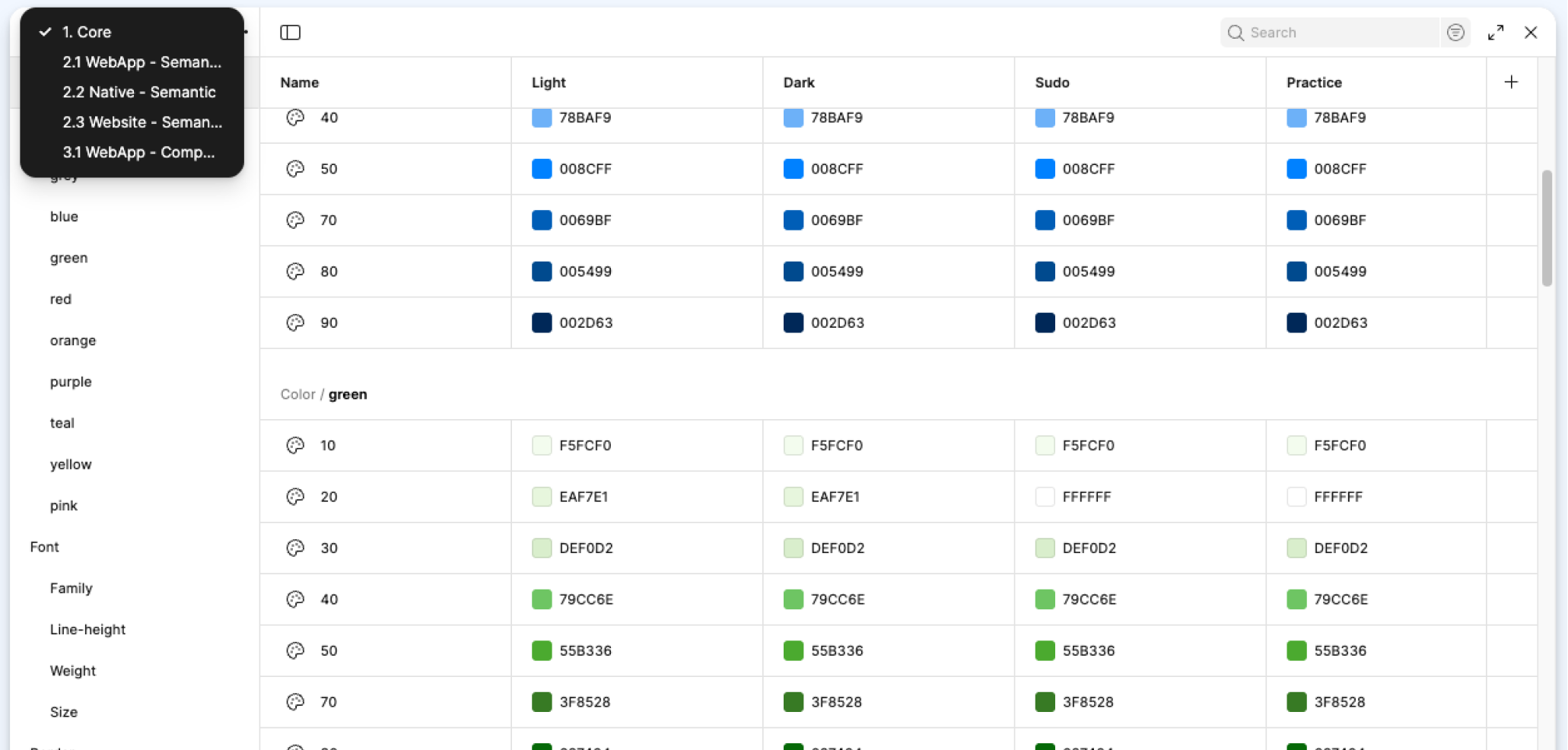
Core tokens set in Figma
Challenges & Goals
The existing tokens were nonexistent and completely unclear in their purpose.
Designers had no shared semantic language for spacing, colour, or type usage, which led to inconsistency across design files.
There were no distinctions between core values and semantic roles, which made scaling hard.
Engineering had limited visibility into design decisions, creating some friction at handoff.
We needed a token strategy that was clear, structured, and expressive. Not just for designers, but for everyone building product UI.
Solution
We introduced a three-tier token architecture and rooted in our new brand system:
Core Tokens
These are the raw values. Hex codes, font stacks, pixel values that define the base design language. Think:blue-50,font-size-400, orspacing-200.Semantic Tokens
These define the purpose of a style in context. For example,color-background-primaryorfont-heading-large. They abstract the core values and give design decisions real meaning.Component Tokens (where needed)
These tokens sit inside components and allow us to override semantic tokens where necessary (e.g., a special treatment for specific component).
We also categorised tokens into logical groups like colour, typography, spacing, border, radius and shadow, and documented naming conventions to maintain consistency as the system grew..
Process
As both the design systems lead and product manager, I guided this work from strategy through implementation. Collaborating with brand, engineering, and other designers to ensure shared understanding and adoption.
1. Auditing tokens
We translated brand foundations into token values. Auditing everything from palette changes to typography updates and spacing scales. I worked closely with other partners to ensure the new identity remained intact across product surfaces.
2. Defining the token architecture
We created a clear variable structure aligned to our token tiers (core, semantic, and component). We documented this in a spreadsheet and implemented consistent naming conventions and grouped variables logically to support Figma’s new variable modes and collections.
3. Aligning with code
I worked with engineering to validate token names and structures against our CSS token layers, ensuring design and code used the same language.
4. Tokenising in the UI Kit
Once our foundation was in place, I led a full pass through our Figma UI kit — replacing all hardcoded styles with tokens and adding semantic labels where appropriate. This made components easier to theme and update globally.
5. Documentation and rollout
To support adoption, we created Notion templates for token documentation, published guidance in FreeStyle, and held working sessions to onboard product designers and engineers.
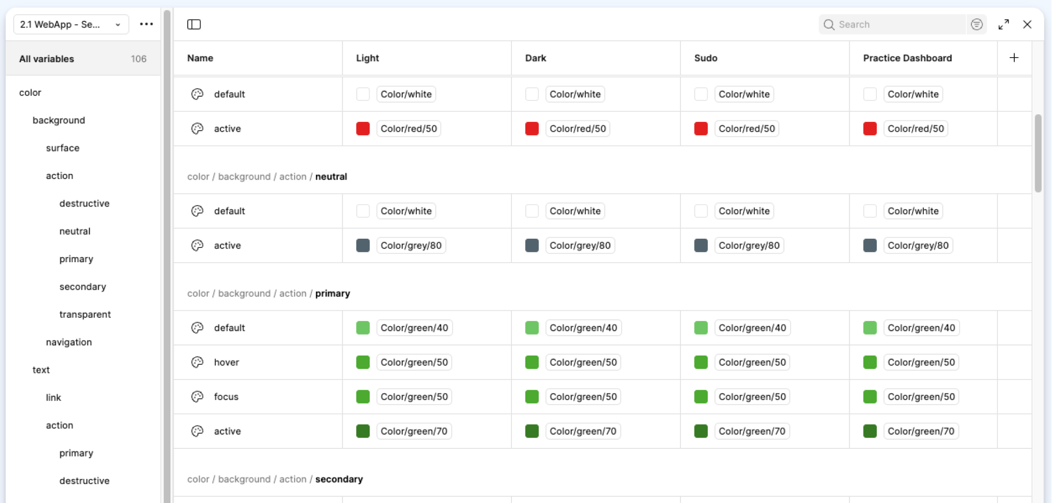
Variable collections split into Core, Semantic and Component level.
Semantic level meaningful variables.
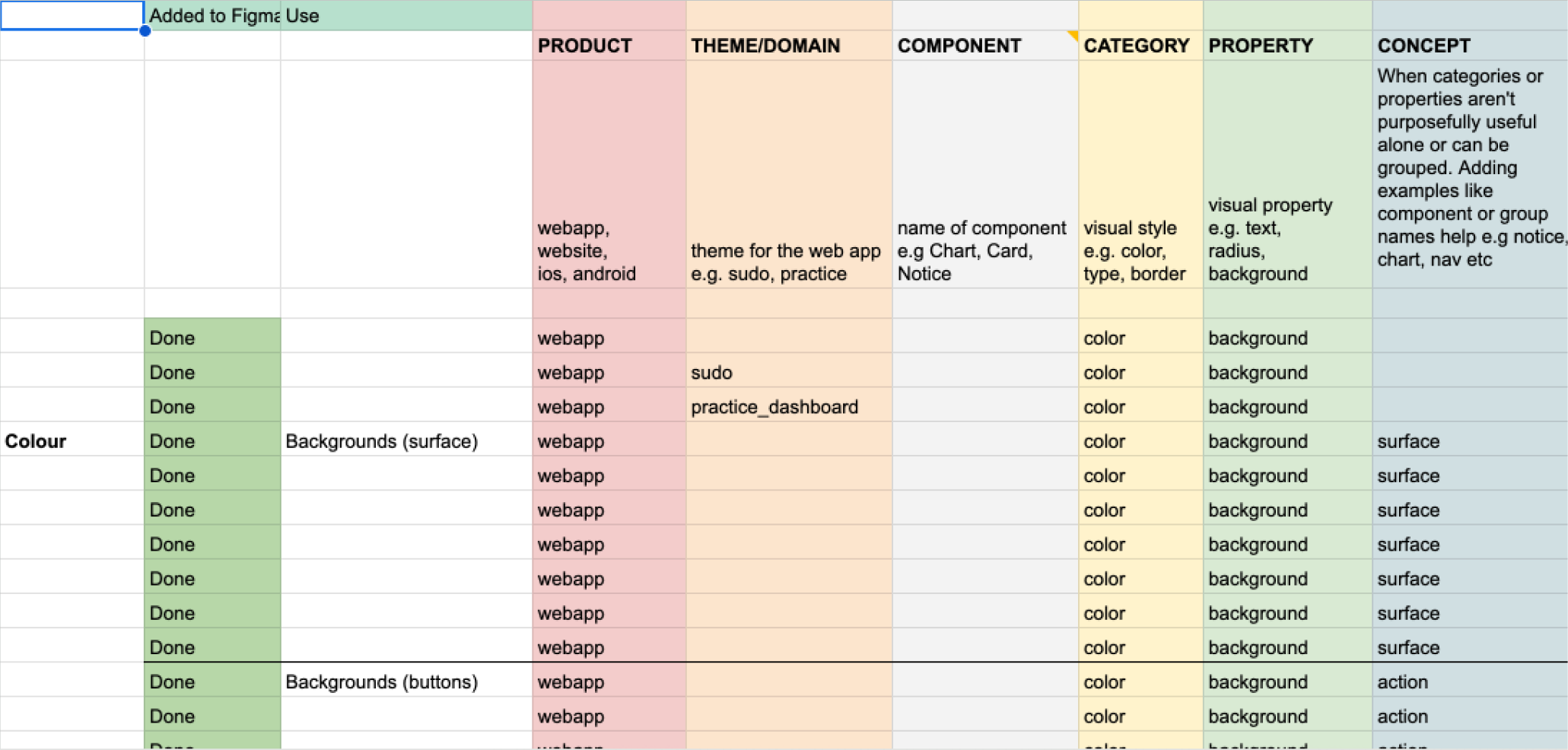
Spreadsheet outlining token structure and token categories.
Results & Impact
🎨 Brand alignment across product: Design tokens now reflect the new identity consistently and confidently.
🧱 Foundation for theming: Our token structure is built to support future needs like dark mode, accessibility themes, or brand customisation.
⚡️ Increased velocity: Global token changes (like updating spacing or colours) now cascade through the system and products
🤝 Improved design/dev collaboration": Shared token naming and clearer intent reduced friction and back-and-forth during handoff.
📚 Better documentation: Teams can now look up token purpose, usage, and values directly from the system, instead of guessing.
By rethinking our design tokens as infrastructure, we unlocked consistency, flexibility, and long-term scalability for every team building within the product.
Overall outcome
Brand experience consistency.