
Improving efficiency, clarity, and scale through better documentation
As our design system slowly matured, we hit a bit of a turning point where our documentation needed to catch up. Teams were relying on outdated or no guidance, key components lacked context, and the structure we had wasn’t built to scale with the growing system. Designers and engineers were spending too much time hunting for answers and duplicating work instead of building with confidence.
So we set out to redesign our reference website from the ground up. We called it FreeStyle, which was a new, structured, on-brand place for our design system documentation. This wasn’t just some visual refresh but a way of rethinking how we guide teams to use our system effectively and efficiently.
Objective
To create a central, scalable, and easy-to-navigate source of truth for our design system. One that reflected a recently updated brand, improved usability, and support team velocity.

Old FreeStyle website was no longer on brand and not scalable.
Challenges we faced
Flat, unscalable navigation made content hard to find
Inconsistent documentation (or missing entirely) led to repeated support cycles and questions
No visual references meant uncertainty around implementation
The structure didn’t support new use cases like patterns or layouts
What we delivered
We rebuilt the FreeStyle site around clarity, structure, and usability.
Scalable information architecture
We redesigned the left-hand navigation to group components, foundations, and patterns in a way that could grow with the system.Brand-aligned visuals
The new site reflects our updated brand, including colours, typography, iconography, and overall layout patterns.Component screenshots
Each component page includes up-to-date screenshots that help users identify and compare component states quickly.Table of contents for quick navigation
We added local TOCs with anchor links so users can jump to the right section of a component without scrolling endlessly.Component and pattern pages
We’ve started to define UI patterns — like bulk actions, filters, and layout structures — that help teams think beyond individual components.Improved navigation and page structure
Cleaner page hierarchy, headings, and anchors made content easier to scan and reference across teams.
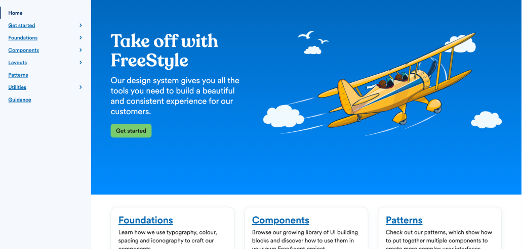
New homepage with improved navigation and structure
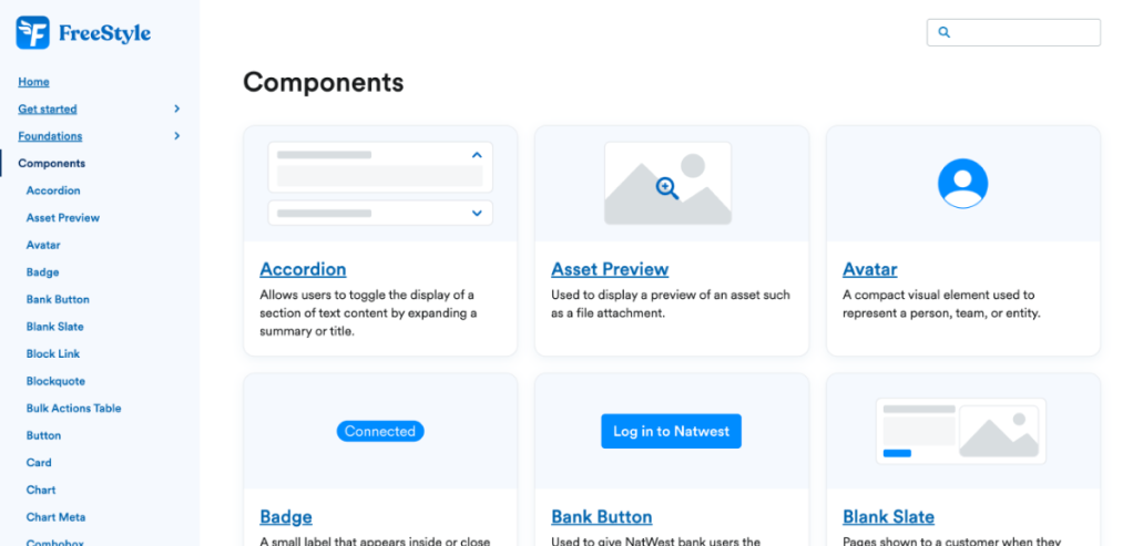
Screenshots that help users identify components

Table of contents for quick navigation to component sections
How we got there
I led this work end-to-end as a design systems lead, partnering with engineering and contributors across design and product.
We began with a full audit of the current site and system artifacts. From there, I mapped a new information architecture and worked closely with engineers to design the new navigation.
One important part of our process was creating documentation templates in Notion. Before anything is published to FreeStyle, it starts in Notion, where we use standardised templates to draft every page. These templates include fields for:
Component Title
Component purpose and usage
States and variants
Behavior and accessibility notes
Related tokens and design specs
etc
This Notion-first approach helped us streamline content creation, ensure consistency, and make it easier for other contributors to write high-quality documentation. Once reviewed, content is migrated into our FreeStyle site using some custom markdown.
Results and impact
So what was the results from all this effort?
🔍 Reduction in Slack questions around component usage within the first couple of months
🚀 Faster onboarding for new employees with a clear, structured starting point
📚 Higher documentation coverage, especially for components and patterns
🔁 Easier contribution workflows thanks to Notion templates and Figma guidelines
🧭 Improved discoverability across all sections, which saved teams time and reduced inconsistencies.
By investing in our reference site, we created a stronger foundation for how we build, collaborate, and scale across teams and our products.
Overall outcome
Improved team efficiency and velocity.