Improving data comprehension at scale
As our platform matured and our customer base shifted toward larger, more complex practices, the importance of reporting clarity and usability became increasingly apparent. Many of our reporting tools were heavily used by accountants and high-value customers, but the experience was slightly fractured, hard to scan, and technically inconsistent due to years of different updates across teams.
Reports lacked cohesion, filters were unclear and inconsistently placed, and core elements like titles and dates were often missing or formatted differently. This work presented a key opportunity to scale our premium experience, support our practice channel, and reduce technical debt across a critical part of the product.
All reports lacked consistency with missing titles, dates and a one size fits all reporting doc solution.
Objective
Design and deliver a consistent and more comprehensible reporting experience that would:
Improve data comprehension and reduce cognitive load when reading reports
Standardise the structure and appearance of all reports across the product
Bring alignment to filters, headers, and date controls
Set a strong foundation for future reports and enhancements (like sticky headers and compact views)
Support our product strategy around scaling premium functionality and supporting accountants
Challenges and Goals
Reports had grown inconsistent due to many teams contributing over time
Filters, titles, and dates were often missing, misaligned, or hard to interpret
Table formats made reports look like any other data grid, reducing the perception of "report-ness"
Interaction patterns in filters were inconsistent, and date ranges lacked clarity
Technical implementations varied, making improvements costly without standardisation
Users were struggling to map numbers to headers, especially on wide tables
Solution
We redesigned the reporting experience from the ground up, creating a clearer, more structured, and more readable layout.
Key improvements included:
A responsive report container that adapts to small, medium, or large widths for improved scanability
Clear separation between report filters and the report document, helping the content feel more like a printable report
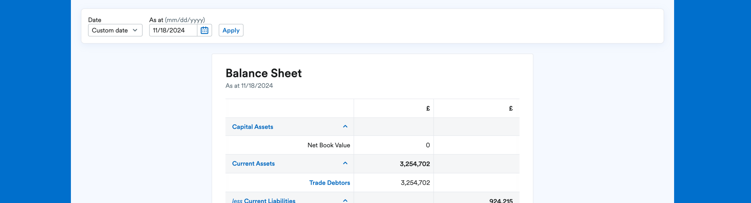
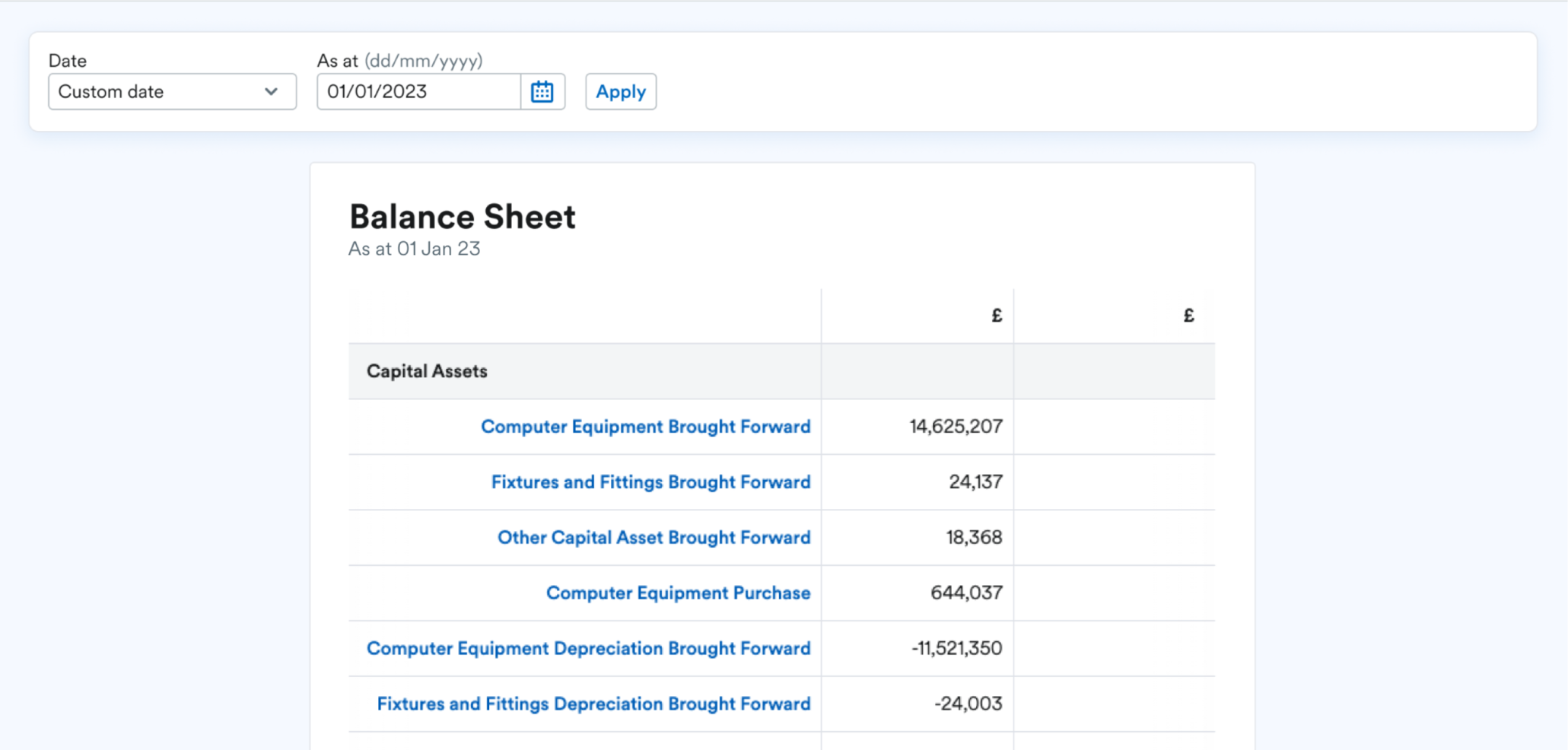
Addition of consistent titles and visible date ranges at the top of every report for better orientation
New labelled filter controls with improved accessibility and grouping
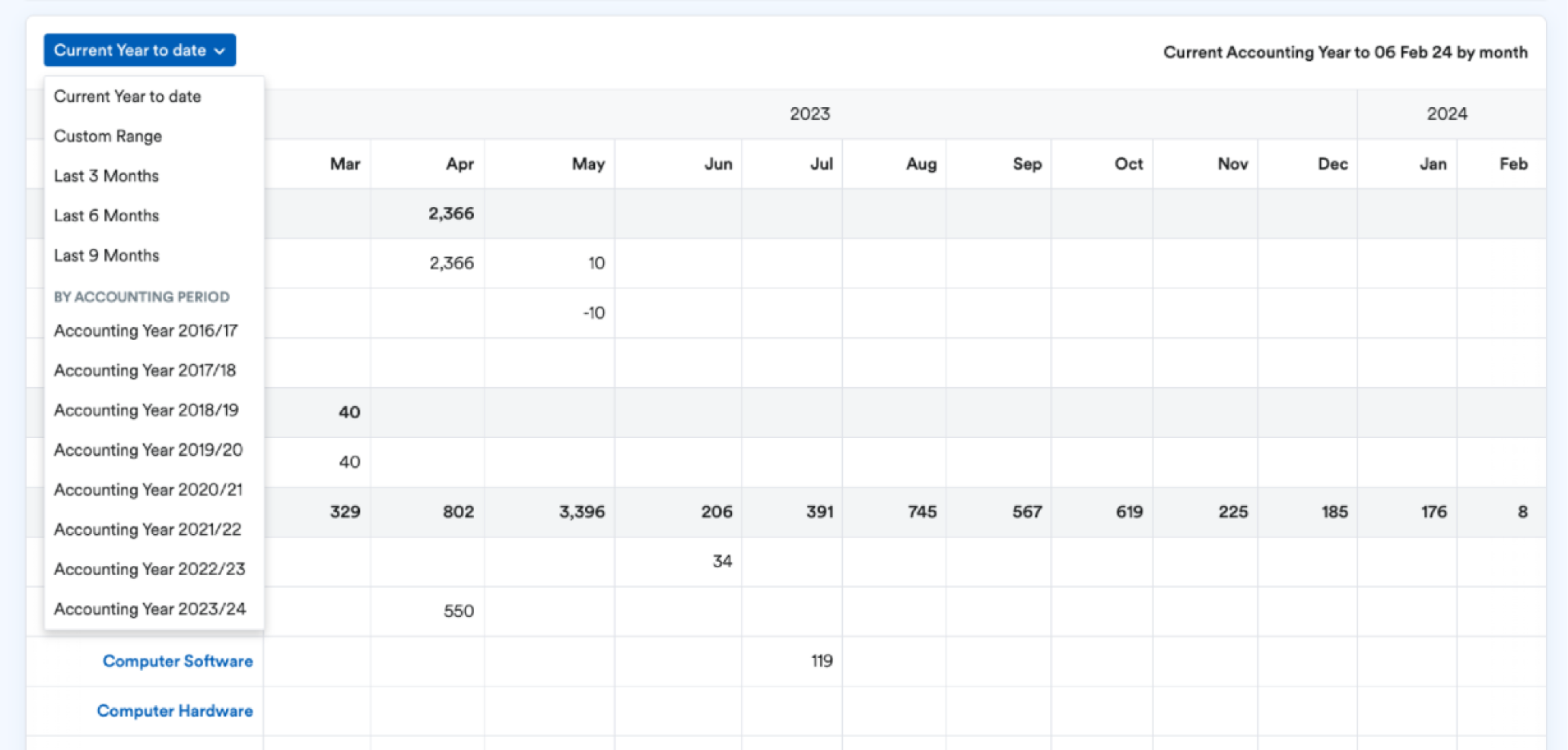
Implementation of a shared date component across all filters with consistent formatting, positioning, and the ability to select common or custom date ranges
Standardised interaction behavior for filters, with a future phase focusing on consistent apply buttons
Use of a monospace font for numerical data to improve legibility and alignment
Unified design and implementation of filters across all reports, reducing friction and tech debt
Reporting experience pattern improvements
Process…
Audit & Alignment
We conducted a deep audit of all reports across the product, identifying inconsistencies in filters, layouts, typography, and structure. This informed a shared pattern vision aligned with both user needs and system capabilities.Design & Iteration
I led the design efforts across layout, filters, and typography, collaborating closely with multiple product teams to ensure cross-functional needs were met. We designed the report container to visually differentiate reports from generic tables and improve readability.Component Development & Documentation
We introduced shared components—including a new common date picker and a filter group pattern—to ensure consistent behavior across implementations. Documentation and usage guidelines were published on our FreeStyle design system site.Testing & Feedback
We conducted usability testing with accountants and high-frequency reporting users. Feedback was overwhelmingly positive, particularly around clarity of common date selections, legibility, and the new structure. Testing also highlighted future opportunities like sticky headers and compact views, now in development.
Result and impact
📊 Improved comprehension:
73% of users said the layout changes made it easier to understand report data at a glance.
📆 Faster access to common dates:
83% of users found the new date component made it easier to find and apply date ranges.
🧠 Reduced cognitive load:
Better separation of filters and content helped users stay focused on the report itself.
🔢 Improved legibility:
Switching to a monospace font for figures enhanced number readability and alignment.
🧱 Technical alignment:
Standardised implementations reduced tech debt and enabled faster rollout of future enhancements.
🧱 Product-wide adoption:
The new pattern was updated across 18 different reports.
🤝 Strong collaboration:
This work spanned multiple product teams, setting a precedent for future shared improvements in complex spaces.
📚 Documented and scalable:
All new patterns and components were added to our FreeStyle design system, with clear guidance and examples for teams to follow
Overall outcome
Customer experience consistency and experience quality at scale.